Extending a design system into a scaleable component library.
PROJECT
Nonprofit website component system
TEAM
3 designers, 1 developer
WHAT I DID
Component design & development
YEAR
2025–2026
VERSION 1
Typography
Our font sizes use a Major Third Scale. Sub-headers are paired with a header one size larger, creating a hierarchy that stays clear across the system.

VERSION 2
Color
Large swatches make the palette easy to audit: hex values, names, usage, and the supporting gradients all have a clear home.

VERSION 3
Example Components
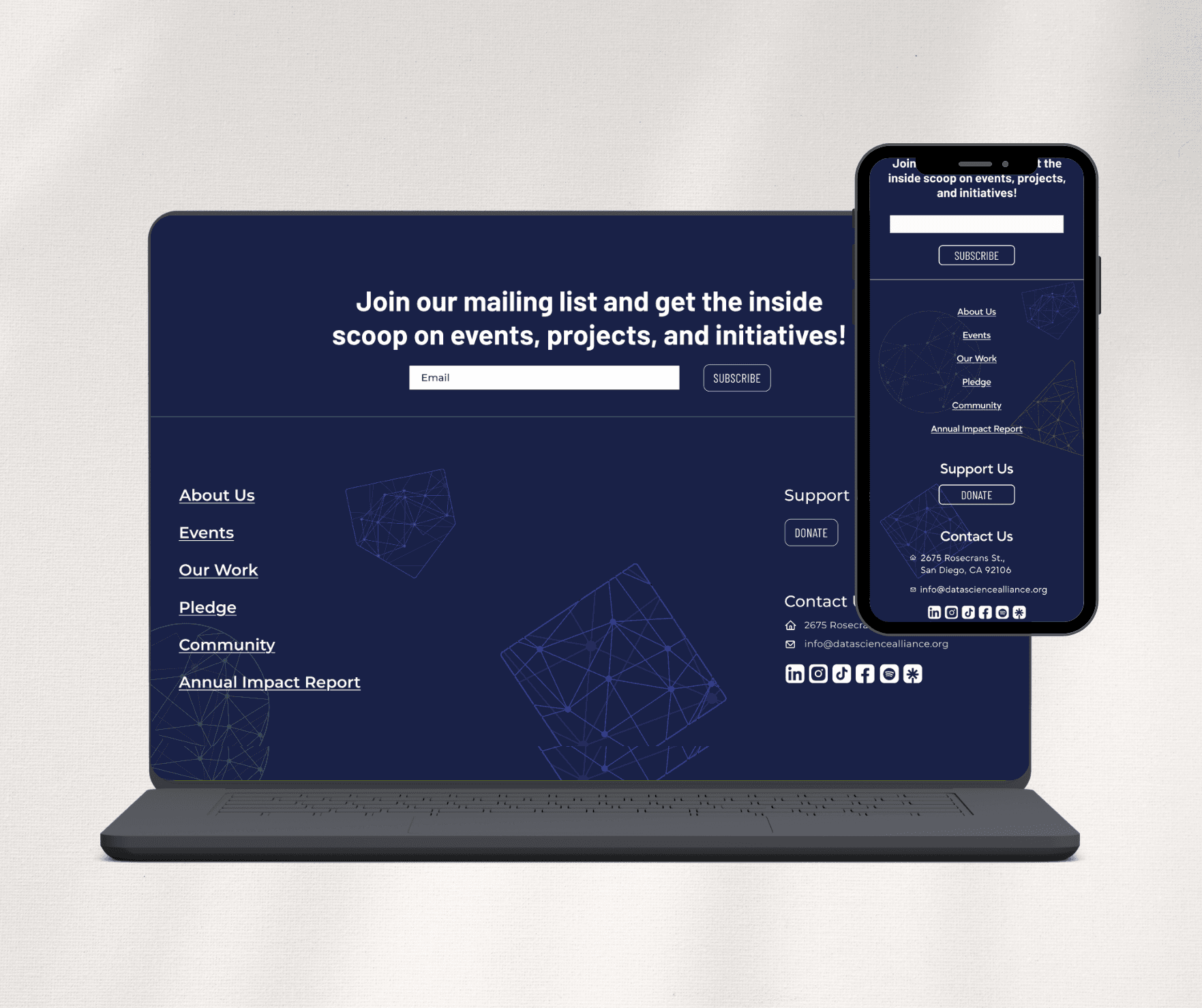
Maintained brand alignment by integrating vector elements and color treatments consistent with the design system.
01 / 04
Navigation
A single navigation system behaves clearly across each breakpoint, collapsing into a focused drop-down menu when space is limited.


IMPACT
Refined UI details, accessibility, and responsiveness to ensure a consistent final design across devices.


