A History Channel redesign focused on content discovery.

PROBLEM
Real users had already described the problem in app store reviews: finding something to watch took too much work.
RESEARCH
App store reviews
Three complaints kept repeating. Users liked the shows; they were frustrated by the work it took to find them, the ad load, and the cable wall.
Surveys
Surveys backed up the reviews: viewers subscribed when they could find something worth watching, not out of brand loyalty.
ITERATE
Prototypes
With the insights in hand, I prototyped three viewer moments: how people browse, how they sign up, and how they share what they’re watching.
• Content discovery, free trial onboarding, and sharing content

• Free trial

• Sharing content

DESIGN
Before & After
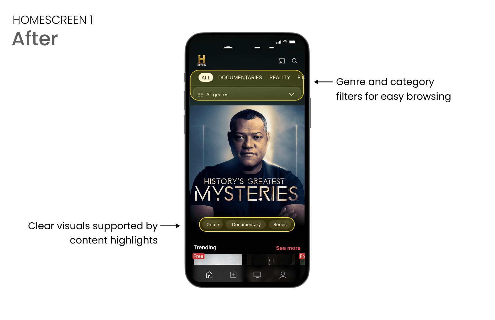
Three screens redesigned in response to what users reported. Each one removes a barrier they described.



REFLECT
This was a self-directed redesign, so I don’t have live metrics. The design decisions are built around the findings: filters where they’re most needed, artwork that leads instead of competes, and a free-trial CTA positioned at the moment viewers decide.